Skeleton
Clean and easy-to-use skeleton loaders for specific components.

Tom Cook
Head of engineering
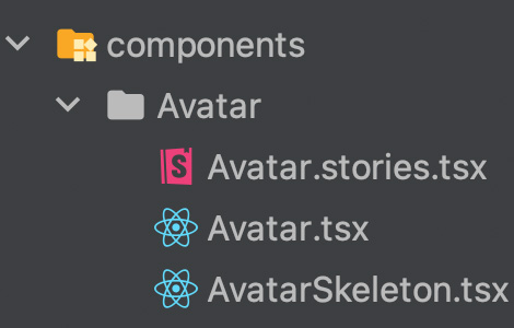
When it comes to loading skeletons, I typically add a dedicated skeleton component for each of my atomic components like Avatar, Button and so on. This makes loading states much more readable and easier to design. Often the only thing a skeleton component accepts as a prop is a class which defines its size.
The skeleton components are typically co-located with the components they represent. This makes it easier to find and import them.
Best Practices
Use template literal types to narrow down allowed class names.
className: `w-${string}`;Access Tailwind CSS' theme with arbitrary values and access an object's value by directly calling the index on the definition.
const heights = {xs: "[--line-height:--spacing(4)] ...",sm: "[--line-height:--spacing(5)] ...",base: "[--line-height:--spacing(6)] ...",}[size];Define CSS custom properties on the parent component to access them on the children.
<div className={clsx(heights, 'flex h-(--line-height) items-center')}>
Requirements
Code
import { clsx } from 'clsx';
interface AvatarSkeletonProps {  className: `size-${string}`;}
interface TextSkeletonProps {  className: `w-${string}`;  size?: 'xs' | 'sm' | 'base';}
function SkeletonExample() {  return (    <div className="flex items-center gap-x-3">      <AvatarSkeleton className="size-9" />      <div>        <TextSkeleton className="w-16" size="sm" />        <TextSkeleton className="w-28" size="xs" />      </div>    </div>  );}
function AvatarSkeleton({ className }: AvatarSkeletonProps) {  return (    <div       className={        clsx('animate-pulse rounded-full bg-gray-300', className)      }    />  );}
function TextSkeleton({ className, size = 'base' }: TextSkeletonProps) {  const heights = {    xs: "[--line-height:--spacing(4)] [--text-height:--spacing(1.5)]",    sm: "[--line-height:--spacing(5)] [--text-height:--spacing(2)]",    base: "[--line-height:--spacing(6)] [--text-height:theme('spacing[2.5])]",  }[size];
  return (    <div className={clsx(heights, 'flex h-(--line-height) items-center')}>      <div        className={clsx(          'h-(--text-height) animate-pulse rounded-full bg-gray-300',          className,        )}      />    </div>  );}